Windows 7 ate my hamster
Not waving but drowning. Woopy do, windows Vista was a steaming pile of dog turd. Ask the internet. Windows 7 is better and marvelous and windows is saved world is perfect.
Errr... No. Right now "tings not lookin good".
First of let me say Boy is it Ugly I mean god damn. It looks like a cross between the 1980's fashions and a 1970 illuminated dance floor. Apple must have burst out laughing. Vista went for a fairly minimalist black. Windows 7 has gone for the transparency, blobs and "vibratent" colours. For virbrant read garish. Imagine you are a teenage drinker. Windows 7 is like trying to go online wilst drinking alchopops. Looks like your viewing the world through the bottom of a glass of WKD.
The loading screen they've gone for a sort of watery grave motif. Blue streaky background, looks like sunshining through water. Give the unpleasent sensation of drowning.
Distasters already achieved.
- Windows 7 can't count. Installed it on the second Hard Drive. It broke the boot system for windows XP and its self. It turns out It can't even install a bootloader in the right place. Way to go windoze.
- Windows 7 Experiance. I think this a benchmarking tool that encourages you to upgrade to a faster pc. In my case it crashed the computer. Rated my windows experiance pretty well I recon
- Windows 7 Designated driver. OK hardware support. Fairly modern PC 3Ghz Hyperthreaded P4. Well above minimum specs, wind 7 runs nicely. Intel 915 based. 2 gig Ram. Buisness machine, billions produced. No divers for Windows 7 or Vista. FAIL
- Windows Software. One of the arguements for windows is the massive collection of software available for it. Will it run on windows 7. Errr probably not.
- WIndows Doom™, UAC the Union Areospace Corporation, err I think. Well you know the way that windows goes "blang" and pops up a dialog saying something that you never read. Every now and again microsoft get disapointed by the infrequency of these horrible boxes and invent new way of putting more of these boxes in various unexpect places. That Bloody Paper Clip is the most infamous(right hand side of screen), next is the "This device could perform faster" USB thing (bottom right imposible to get rid off), and everyones favourite, the auto play list, which pops up 500,00 useless options when you plug in your usb stick. No I do not want to burn-the-contents-to-blue- ray-and-sell-them-on-ebay F**k Off. Windows Officandoes (thats Bill Gates and a Bloke called Dan) will be delighted that Windows 7 has a new way of poping up irritating boxes all over the screen. Its Called UAC which is, I belive a sinister corporate entety out of a scinece fiction-horror computer game. Well Named. Particularly impresed by the "Do not Show this Dialog again" checkbox. Nice Idea shame it doesn't work.
In summary. Main features Its has looks only a mother could love. Will take several years till old hardware has gone out of circualtion and it can be expected to work. Its interface is typical microsoft one window at a time plod. The nice thing about it is nobody will be scared of it, nothing has changed for the user it still works like widows 95, only the've cahnged the name of networking AGAIN, and moved the buttons around and renamed them. Not sure why. All the woderfull enhancemnts the nobby apple or linux desktops provide like window pickers multiple workspaces etc are absent, even the silly eycandy wouldn't run for me no graphics card drivers. Its more of the same. But won't run on your hardware. Its another widowns shuffling the deckchairs routine. The Systray in the corner now has a feature to try and control the mess of shite that appreas there. Micosoft solution is to make a big menu to hide bits. Its rater like the treating the plage by painting over the spots. Likewise the start menu has alaways been a disasterious mess on windows. Unless you manualy organise it yourself. The Vista and 7 solution is the make it searchable rather than actually fix the problem like Apple Linux etc have done by stuctureing the menu so you can actually find things.
More of the same really. A problem worked around, again, is a problem deffered to the nextr version of windows.
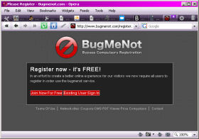
April Fool
Bug Me Not
Is an exelent website providing a list of passwords to free registration sites. You know the REALLY annoying ones that make you type spurious data, Michael Mouse and a one shot disposaable email address in to do anything. Well today (April the 1st) you have to Register to use their service.
Ha Ha very funny now give me a password to some shitty PHP scripts repository site so I can confirm it doesn't do what I want and go away and write my own.
I'm up to my usuall tricks again, I have just writern a script to parse GPS Exchange Format Files (.gpx) and stuff the trackpoints into a database for future use as Geotaging for photos and mapping.
Basicaly an electronic game of join the dots, 65000 dots. Now I wonder if I can parse the log book files of Max Sea?
